- combining similar images
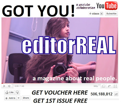
- the theme of the fonts and colour scheme run through both the magazine and the pop-up ad so you can see they are linked
- the pop up ad appears like a youtube video, hopefully interesting the consumer (who may go to 'play' the video but instead will be redirected to the 'free magazine voucher' and they may just print it out of curiosity).

i used my own video on youtube as a template for my pop-up ad.
 the scheme of the colours and fonts ran consistent throughout the magazine cover, and continued this way into the finished pop-up.
FINISHED POP-UP AD, WHY IS IT SUCCESSFUL? WHY IS IT CONVENTIONAL?
- eye catching phrase "got you!" may confuse/startle the consumer into taking a second glance at the ad, and then continuing to read what we have to offer.
- the offer is clearly visible "GET VOUCHER HERE, GET 1ST ISSUE FREE" so hopefully curiosity would encourage further interest.
- the same fonts and colours run through the pop-up ad as they do on the magazine, so some form a corporate identity is established, the ad can be recognisable after sighting the magazine cover.
- added in "506 million views" this may momentarily trick the consumer into thinking the magazine is extremely popular and very mainstream already.
- the YouTube logo is present, not only is it recognisable, it is established so the consumer would know the pop-up has a certain level of safety linked to it.
- the content of the magazine is make clear, repetition of the word 'real'.

No comments:
Post a Comment