Sunday, April 3, 2011

MY MAGAZINE COVER.


i will embed my prezi, so you can have a closer look at the cover, and read the explanations as to why i did it this particular way.


Test shots based on Storyboarding

plus costume fitting, checking that the 'bin bag' dress was plausible.


  • these are the bench shots i wanted at the very beginning of the ad, they are good establishing shots as the audience is introduced to the character who is reading a magazine, they are made aware quickly that the magazine is being criticised. it also shows that the light outside is very suitable even in less-that-bright conditions.
  • travelling shots as Sophie walks towards camera, this way we got to experiment with the travelling shot, i gained a lot of practice so when real filming was upon me, i would be fluid in my camera movements, it was a good idea to test this as we found that a good pace had to be established when walking towards me and the camera, otherwise the actress would be left behind or even treading on my feet as i didn't move swiftly enough.
  • we used a tracking shot to show how we would film the 'paris hilton' figure, at first we saw the camera jumped a little as it followed her steps, but i found this was effective as it showed the airiness of her walk, as if she's in her own little world as she literally 'struts' through life, with ease.
  • we then tested the dancing scenes, the high angle worked really well as we were able to see Sophie's feet working (hahaaa!) but the distance wasn't too great that eye contact couldn't be established between Sophie and the camera/audience. I played round with 'slowing' down the video, i thought when audio was added (with a heavy beat), it would be that more effective, and could also reflect the influence the alcoholic beverage was having on the character. But i then also tried speeding it up, i found this made the 'celebrity' look all the more comical and foolish, this would make it easier for the consumer to take sides with the character that criticises the celebrities and therefore they would be favouring the side on which the product lies.

Began the storyboarding process Plus: Development of the Ad Plot and Meaning


first storyboard was very detailed, but got lost during test shots.
but it's fine as i had it quite clearly in my head, apart from the first 5/6 frames.
But as i lost my 'fine art' that was my storyboard, i decided to explain the background the advert plot and the sort of camera angles i wanted.

I apologise for the audio lagging, and my husky voice.


as for audio: the key things i wanted were
  • the sound of the rustling bin-liners when my actress was shown in her 'designer' dress
  • the sound of tearing (when the magazine is torn) or audio/music that fits the action of the ripping.
  • the sound of the dog growling, when a new dog is handed to my 'paris hilton'-like character.
  • when i have a character in a nightclub with his alcoholic drink, i want the club/d&b music to be very heavy and for flashing lights in the room to fit the beat of the music and his movements (very fluid movements).
  • the voiceover at the beginning, i would like to get louder and for the tone of 'annoyance' to become stronger as the reading progresses.
  • i would love to include the song "Miss Hilton" by the Penfifteen Club, as it's describing the LA life and attitude of Paris Hilton and i feel it fits my celebrity characters, as we witness their naive actions and irritating tendencies.

LYRICS annotation
Oh my, looky there
Stone-cold foxy, platinum hair
typical celebrity image - fakery and material items
Short skirt, barely there
willing to act/appear foolish or outlandish to get press attention
Make a chick wanna hate, make a boy wanna stare
dog-eat-dog, gain many enemies and haters.

Well, Ms. Hilton you must be worth a trillion bucks
celebrities receive unnecessary amount of money for the very little they do.
Get the feelin' that you don't really give a fuck
not bothered by the press, or in some case every much bothered by the press, money can't give you happiness.. it appears most celebrities are very unhappy but put on a positive image for the camera.
Ms. Hilton I like the way you push and glide
Rollerskates on a social butterfly, whoo! Social ladders to be climbed, it's who you know not what you know in the world of celebrity..

Breeze by, velvet ropes once you've 'made it', you can get away with anything, no such thing as bad press.
Ski this town like a bunny slope Breeze through life with ease.
Oh my, there she goes
A Long money girl in her short money clothes Material goods, image, all important.


Name of The Magazine

i spent ages trying to create some new rearrangement of "YouTube" so the collaboration with them was obvious to the consumer, but everything i could think of seemed too obvious and unoriginal in it's sound, as when i personally hear a variation of Youtube i think of "RudeTube" the Channel4 programme.

eventually i came up with:

"editorREAL"

it contained the word editorial (and without the spelling, it sounds like it is on paper alone), so the consumer is instantly made aware that it is a magazine/editorial product. With the alteration to include the word REAL on the end, upon further investigation to the magazine (or through interest sparked from the spelling of the magazine name) the consumer would realise the content of the magazine is 'real people' rather than celebrity banter.
i feel it is quite catchy and easy to remember, plus it is easy to pronounce and unique in the sound, as generally magazine names are one/two syllables.

Let's Look At Advertising..


There is obviously a strategy to selling a product.
My teacher was kind enough to hand me tons of information of advertising, what is conventional of advertising, and how does it alter as we target different ages/genders etc or depending on what product is being pushed.
I found some key ideas that are supposedly to be running themes throughout advertising, and seem to be effective.
"applying to my project"

"AVANTE GARDE"
This is the theory that a product can be appealing to an audience (in particular younger people - under 18's) if it's marketed as the 'newest' or most 'updated' model available, people are eager to have 'the best' and so if a product is being pitched as something particularly revolutionary or special then people desire it, as they hope to keep on trend. My magazine is new, and the 'hook' of the magazine itself is that it is offering EXCLUSIVE information/software/content that is ONLY available to those who purchase the product. This fits perfectly, as despite not being expensive the product is being presented as something unique and exclusivity is given to whoever pays (to a certain extent).

"FACTS AND FIGURES"
It's common for products to be backed up by evidence, the companies would pitch products and give evidence (often numerical) as to why it is specifically better than another product. It is difficult to merge information such as this into my advert without sounding 'intimidating', as it's aimed at a free-thinking and creative audience, they may find it patronising to have figures thrown in their direction, especially when the product (magazine) has no particular function that can be compared to another (fabric softener removes blahblahblah% more than leading brand..).

"WEASEL WORDS AND MAGIC INGREDIENTS"
the idea that products can be presented in an ideal light without giving firm evidence or assurance that it does the job, and suggesting that the product contains something revolutionary that makes it different from the rest. This may be more relevant in products that are consumed or used cosmetically etc, but it could be said my magazine uses the 'magic ingredient' as it is suggesting that it is completely different from the majority of mainstream editorials that are available currently.

"PATRIOTISM"
People find products appealing if they are exerting a love for the country in which the consumer lives, for instance..
Jack Wills clothing is displays great British Pride with it's slogan "Fabulously British"
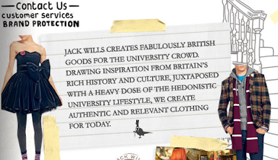
I want to say my magazine would NOT be considered a patriotic brand/corporate identity, as it is merging with the web which in itself is the 'World Wide Web', my product is all about interacting with a variety of people from around the world, but it could be said that my magazine is patriotic in a way.. it is attempting to 'unite' the market it is targeting,
it is encouraging people to get creative and share opinions and views online, being open to debate and meeting new people. Rather than reading the rumour and fiction that often fills the tabloids and magazines available to them.

"SNOB APPEAL"
suggesting the product makes the consumer part of an elite group, displaying characters of a luxurious and glamorous lifestyle. My product does both this and the exact opposite, it insists that the consumer gains exclusivity by purchasing the magazine, gaining access to information etc that is unobtainable to those who don't, while it directly mocks people of anything other than a working class/ from a modest background.

"BRIBERY"
having something to offer the consumer in exchange for their purchase, in the case of my product, it is that a voucher is available to get the first issue free.. otherwise the product is still cheap. And free gifts are also part of the purchase, with promises of more in future issues.

"PLAIN FOLKS"
The suggestion that the product is of good value for ordinary people, probably one of the most important hooks to my magazine, that it is not only specifically targeting ordinary people (though web-literate), the product itself consists of the the works of normal people, making the character's put to the consumer.. relatable and likeable, making the product appealing and increasing the chance of repeat purchases and returns to the magazine website/online content.

"TESTIMONIAL"
basically, product placement.. celebrity endorsement, making the product look more appealing as the audience feels that the product must be effective/successful as the celebrity swears by it's credibility. Again, my product is the exact opposite of this.. it doesn't need celebrity endorsement as it mocks celebrities and what they represent. Although it could be argued that the product would appear more appealing as the you-tubers that it represents, have large followings and fan bases and could be considered celebrities on a lower level (Internet celebrities, simply another 'breed' of celebrity that have worked their way up using different methods, or unintentionally to such a scale).

"WIT & HUMOUR"
I like to think that my advert would have both these characteristics, and the celebrities are being presented in a satirical manner, it would be good if the audience reacted in a positive way, hopefully entertained by the plot of the ad,

Ads that have Inspired me, or i Admire

1. Guinness - Surfer

This ad i always remember, alike my favourite music video it gives the audience a sense of being.. 'overwhelmed', it uses natural and STRONG imagery, wild horses and the masculine input of a group of surfers. What really appeals to me about this advert is the merging of the white horses and the 'white horses' of the waves (when the wind catches the wave and creates white mist/froth). It is a clever and original idea, and inspired by the 1893 painting 'Neptune's Horses'.

Surfer is a critically acclaimed integrated advertising campaign launched in 1999 by Diageo to promote Guinness-brand draught stout in the United Kingdom. The cornerstone of the campaign is a television commercial, originally 60 seconds long, which centred around a Polynesian surfer successfully taking on a gigantic wave. Shot in Hawaii over a nine-day period and directed byJonathan Glazer, the piece went on to win more awards than any other commercial in 1999 (Clio Awards, D&AD Awards, Cannes Lions), and in 2002 was voted the "Best ad of all time" in a poll conducted by Channel 4 and The Sunday Times.
Wikipedia

2. MoneySupermarket.com


This ad appeals to me because it is humorous and relatable. The main protagonist (Omid Djalili) is blunt and straight-talking/ he doesn't beat around the bush.
His role in this television ad is to speak and act on behalf of the customer, he wants the best deal and mocks/baits anyone who says otherwise. He breaks down the fourth wall by speaking directly to camera, which makes him for appealing to the consumer, as he doesn't sugar coat what he wants and what he aims to get for you, he won't settle for less than the best deal. I plan to have my protagonist speak directly to camera as i feel this makes them for relatable and believable to the consumer. It also makes it more realistic, people often feel lost in film and/or television as they are stuck in the void that this is fictional, and when a character addresses them directly they are caught off guard and pay attention to what is said.

I find it very effective how a tracking shot has been used to follow Omid around, I would love incorporate this into my own ad, the challenge being to keep the filming smooth as both myself and the actor/actress travel.
The lighting is very good, Omid's face is clearly lit, to achieve this i may have to make my location outdoor, or make use of umbrellas, white board or foil (i've been told is very effective) so my actor/actress' face is clearly lit for the camera to pick up, as i hope the plot to be very satirical/sarcastic, emotion in my protagonist's face is important and needs to be registered.
Lighting would be vital for this.
The transitions are quick cuts (see 00.16) and this is effective for keeping the advert at a fast-pace, fitting the dialogue which is loud and blunt.


20 ads That Shook The World - Background Research Into Ads and Audience

I decided to do some background research to see what made a successful ad, or ad campaign and so my teacher recommended this book, "20 Ads that Shook the World" by James B. Twitchell, the book analyses 20 of this centuries most groundbreaking adverts and advertising campaigns and how they've had such an impact that society itself as been altered.
The ad i found most interesting and relevant to my project was the Marlboro Man.
The factor of my project that I would consider to be the most 'post-modern' would be that the people i plan to feature both in my ad and magazine are not in the position of fame or popularity, they are perfectly unknown and unrecognisable, and that is what i hope to be their appeal alike the characters on YouTube. This is a new idea that has only recently cropped up in ads such as confused.com, and the general public only generally make television appearances on the news and game-shows which also aren't as common as they once were, as people are more keen to see 'Celebrities' compete for charity etc.

What the 'Marlboro Man' is, is exactly what my advert is going against.
He is fabricated and fictional, a corporate image representing a product in a way that the company feels will be most effective and profitable to reel in the consumer, who subconsciously aspire to be the clean-cut, strong-jawed and handsome (heroic figure that is a cowboy) representative that the 'Marlboro Man' is.

MARLBORO, went from selling less than one-quarter of a percent of the American market in the early 50's, to being the most popular worldwide in just 25 years, EVERY FOURTH CIGARETTE SMOKED IS A MARLBORO.
So how have Marlboro done it? The first point that '20ATSTW' brought up is that Marlboro are selling an image. Alike 'bottled water' and 'whiskey', if handed a different brand of cigarette, a smoker will identify it as their own if you were to name it as thus, the consumer is tasting an image rather than the product itself, so image is what will bring them in.

The beauty of the Marlboro Man is that he is just that fictional, he plays on the expectations and fantasies of the American public.
After failing to alter the product ("beauty tip" of the cigarette) to attract the female consumer, they focused on finding the most masculine representative they could manage, Cowboy was a fitting image.
"But these admen were not thinking of the real cowboy, not some dirty, spitting, toothless, smelly wrangler. They were city boys who knew cowboys in bronzes and oils by Frederic Remington, or in oils and watercolours by Charles Russell..
.. Marlboro Man was not always a 'real' cowboy, just don't remind them that almost half of real cowpunchers were black or Mexican."

The cowboy image has been hollywood-ised, the Marlboro Man, he is a white American, but tanned, clean cut in his Levi jeans, cleanly-shaven, he 'doesn't speak' because 'he doesn't need to..", he is an enviable image, as he stands strong with a cigarette hanging out of his mouth, a heroic figure the Americans would relate to the likes of Clint Eastwood.

What i can gather from this ad, is that generally the public want to be spoon-fed fiction. They will buy and consume whatever visually appeals to them, this therefore technically makes my project all the more difficult. What i plan to give the audience/consumer is the real deal, although i know that the likes of YouTube broadcasters, people like myself, have become is much more popular in the past decade as younger people have been given access to the Internet - what i see everyday in local newsagents etc is magazines pushing stories and photos of celebrities, rumour and scandal is what sells..

but i must also consider, that now with access to the Internet growing and access to the same content is available online, people are less willing to made the distance to the shop to buy paper editorial, this is find would be in favour to my magazine (being web-based once it has become established, apart from the mailed subscriptions).