Megan's A2 Media Blog
Monday, April 4, 2011
Audience Feedback On Television Ad
the responses i got back showing the advert were quite positive.
many points were raised both positive and critical, the critical i was already aware of and sahemd to say that i wasn't clever enough to correct :')
TUMBLR FEEDBACK
 Jess: "I really like the use of colour, it's very unique and i haven't seen that on a cover before, they are normal quite neutral backdrops and the people on the front are famous, this is a nice change, and the magazine name is quite clever"
many points were raised both positive and critical, the critical i was already aware of and sahemd to say that i wasn't clever enough to correct :')
TUMBLR FEEDBACK
- "Really like the characters portrayed in the ad, like that the same actress has been used throughout, shame about the audio dipping at the end" Jess
- "like the variation of speeds of the video, keeps the advert exciting" Ash
- "Was a very long advert but didn't get too bored, not sure how I'd react to it if i was waiting for my programme to come on and this appeared though!" Serene
- "Very funny and interesting, and the product is different also" Jasmine
- "i don't know if it's down to you but the visual quality of the advert was very good, and the camera angles were good too, i really like the exchanged glances between the paris girl and the dog" Annie
- "I want the garbage dress! the plot is very unique and i liked it" Ryan
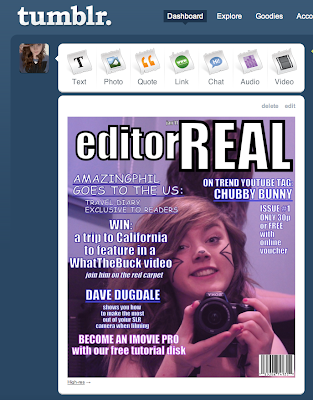
I then showed them the magazine cover and the response was very positive.
 Jess: "I really like the use of colour, it's very unique and i haven't seen that on a cover before, they are normal quite neutral backdrops and the people on the front are famous, this is a nice change, and the magazine name is quite clever"
Ash: "this is really cute, but i'd worry that it may only attract girls who find the person on the front relatable, it may take more to encourage a guy to give it a second glance"
Serene: "The colours are really nice, it's a very warm cover, i think people would be happy to look at it, it's eye-catching"
Jasmine: "the stuff on the front seems like the sort of things i would like to read about, I LOVE AMAZING PHIL HAHAHA<3 so i'd definitely read it"
Ryan: "I agree with Ash in some respects, the issues and articles on the front would appeal to me but in a shop i would be unlikely to look at it in the first place, i gave your blog a quick read though and i agree that it'd be a good idea to have it more web-based so both genders could be approached differently"
10 second ancillary task.
This is a sponsorship sequence, it would appear before a series of adverts during prime-time television or just before the programme returns. It is short, but would be viewed many times over during the multiple commercial breaks that are common with popular television.
Popular sponsorship sequences, i am aware of are those such as the Xfactor ads, which although short and repeated all too often.. stick in the consumer's mind.
IDEALLY..
..there would be no limit to how long my advert is.
Generally adverts are 20-40 seconds long, some as short as 10-15.
My advert is over a minute, i thought this could hinder it but Yeo Valley have become very successful after their two-minute Rap Avert (now, even available of iTunes to download)
I feel that if the audience's attention can be held for the duration for the advert, then the length is not relevant.
Transitions

i decided against using fancy transitions as i feel it distracts from the advert content, and so i used very simple/quick cuts and one fade out at he advert's end which was also quite quick, i wanted the transitions to fit the fast-pace i wanted through the ad.
Because, i feel that although it is very long, for an advert, it doesn't seem like a minute and a half.
Audio In My Ad


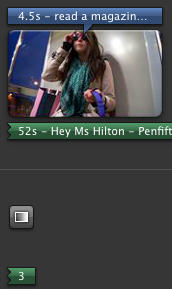
In the end i did choose 'Miss Hilton' by the Penfifteenth Club as my audio, i felt the lyrics of the song were fitting to the plot of the ad. Also the first part of the sing was quite gentle (listen for sound of, what could be a triangle of a xylophone) and then picks up upon my 'heiress's' entrance. I felt it 'ironically' fitted my own narration of the advert, while the song talks about the strong attitude of the celebrity, when used in my advert it could be said that the celebrity is being presented as someone who is too air-headed to realise they aren't always liked.
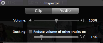
I used track ducking to bring the volume of the song down when voice overs were played, so the audience could clearly hear the narration of the ad but could still appreciate the background music. Unfortunately i struggled with the fading in and out of the music, the fade out near the end is very drastic and i was unable to figure out myself how to correct it.
I added in audio for my dog growling, and also brought the volume of the audio up when my actress was speaking, this also brought up the background interference which was a shame but i feel that the music added helps to disguise this a little.
The voice-over/narrative is myself, not just out of convenience but i felt because the main character was female then.. the voice over needed to be also, or there could be confusion as to who was speaking. I also feel that a female voice sounds more emotive, and i wanted sarcasm to be shown subtly through the voice over itself.
Sunday, April 3, 2011
My Finished Advert
unfortunately my memory stick has gone walkies, so more pre-production may appear after this.
but this is the finished, edited product.
Subscribe to:
Comments (Atom)